
The legal profession may be finally accepting the reality — and philosophy — of the open-concept office.
When Marcus Sixta was in law school, he had the usual ideas about what professional life would look like if he made partner at a law firm — including visions of a spacious corner office with leather furniture and walls lined by diplomas and art.
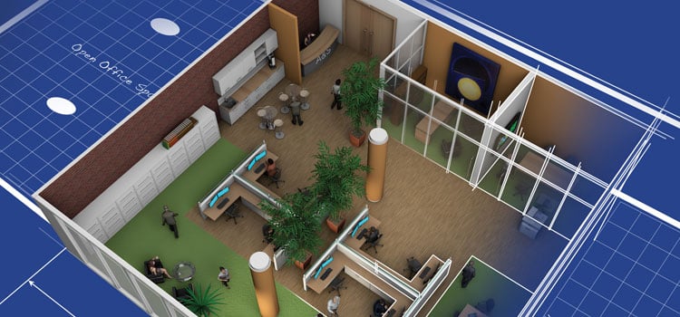
But now that the 37-year-old runs his own Calgary-based firm, the reality looks very different. There’s no art on his walls — because his office has no walls. In fact, Sixta doesn’t even have his own dedicated personal office space.
“I work a lot at home or at the airport,” the family-law specialist tells me. “When I’m at the office, sometimes I’m in a shared space with my assistant. Or I’ll pull up to one of the common tables. If I’m reading a lot of PDF [documents], I can just find a comfortable chair in one of the nooks. Or I can make phone calls from one of the private spaces.”
Sixta’s firm, Crossroads Law, employs four full-time lawyers, an accountant, several contractors and a handful of permanent support staff. By prior arrangement, two workers have their own offices. But everyone else, including all newly hired personnel, typically situate themselves within a communal space that includes diner-style booths, tables with chairs and cubicles — a first-come, first-serve practice known with office management circles as “hoteling” or “hot desking.” Clutter is minimized, with most incoming documents immediately scanned to the cloud and dispatched to recycling.
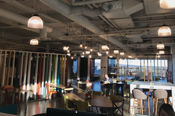 “In the past, law firms tended to use fancy offices to attract new hires,” Sixta tells me. “But I’m not interested in spending a lot of money on overhead or in any kind of ego-based business model. What I offer lawyers is a chance to work from anywhere. If you need to meet with a client or have a sensitive conversation, there are conference rooms. But personal offices don’t mean much to today’s grads. The things they want are more freedom and money.”
What architects call “open-plan” offices have been around since the scriptoria of the Middle Ages. In the corporate world of the Mad Men era, these often took the form of large, almost industrial-sized spaces in which typists, clerks or technicians would be seated in neat Cartesian columns and rows. During the latter half of the 20th century, the advent of modular cubicle technology transformed these spaces from grids into mazes.
The more modern form of open-plan organization — exemplified by Sixta’s arrangement in Calgary — emphasizes flexible landscapes that allow for different working styles and project needs. Such arrangements have become the norm in Silicon Valley since the dot-com boom. But in recent years, even large, staid blue-chip companies such as IBM and General Electric have embraced the trend, following academic studies showing that bright, open spaces tend to increase productivity and employee satisfaction.
Until now, the legal profession has been a notable holdout to open-plan trends. This is a profession that, since ancient days, has always been sensitive to matters of status, protocol and credentials. And the architecture of courthouses and law firms has tended to reflect this in style and grandeur. Even to this day, in the United Kingdom, the most acclaimed lawyers situate themselves in prestigious “Inns of Court,” which resemble small-scale Ivy League university campuses.
Professional conceits notwithstanding, lawyers have had good reason to hew to traditional office structures, which allow them to ensconce themselves in private, four-walled rooms, set apart from secretaries and other laypeople. Before the widespread adoption of email, when legal discussions were almost invariably conducted in person or over the phone, it made sense to create an architecture that acted as a bricks-and-mortar cone of silence. In the more status-conscious days of yore, moreover, clients expected that their lawyer’s offices should look at least as stately as that of, say, a bank manager or a corporate vice president.
But those days are gone. Many corporate closings now are conducted digitally, and most lawyers no longer need great swathes of desk (or floor) to organize case files. Thanks to the availability of video conferencing and other digital communications media, many clients will go months or even years without meeting their lawyers in person. What clients want most from the relationship are cost-effective results, not stylish trappings. And while only a minority of Canadian law firms have embraced the open-concept model as enthusiastically as Marcus Sixta, his Crossroads offices provide a good sense of how lawyers will react to these trends.
If the open-plan law firm movement in Canada has a leader, it’s arguably Michael Walker, managing partner of Miller Thomson LLP’s 75-lawyer team in Vancouver, which recently migrated from its long-time home at 840 Howe St. to a newly constructed space at 725 Granville.
In part, Walker told me, Miller Thomson chose its new Vancouver location because it allowed all of the firm’s personnel to situate themselves on a single floor — instead of spread over four floors, as at the Howe St. location. “We wanted to be more collaborative,” Walker said at the time. “Lawyers enclosed in their offices got in the way.”
 At Howe St., the Miller Thomson arrangement hewed to the usual large law firm schematic — with windowed lawyers’ offices arranged on the periphery and a pool of support staff spread out within. But the dictates of Euclidean geometry made this approach impossible to duplicate in the new space because of how perimeter shrinks in relation to area when a square expands. By way of example: In a 50,000-square-foot space that is divided evenly among four floors — each with 12,500 square feet — roughly 46 per cent of the floor space will be located within 15 feet of an outer building wall. But if all the space is consolidated into a single 50,000-square-foot floor plate, then that ratio shrinks to 25 per cent.
In practical terms, what this meant for Walker was that Miller Thomson’s new space on Granville St., if conventionally laid out, would provide only 40 perimeter offices, as compared to the 75 or so he had on Howe.
“The math is what led to our first big decision,” Walker told me. “The old model with the lawyers’ offices on the outside and then a big parking lot of support people in the middle — that wasn’t going to work. So we said to ourselves, ‘Offices have to come off the glass.’ ”
Once that Rubicon was crossed, Walker told me, a lot of the other stale presumptions that go into law firm architecture suddenly were up for grabs, such as the baseline expectation that every lawyer should aspire to their own enclosed office.
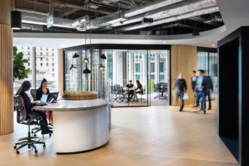
In creating its design for the new offices, Australian-based firm BVN Architecture began by interviewing Miller Thomson staff and even embedding among lawyers to observe how they worked together. What they eventually came up with was an open-concept layout with high ceilings and common areas designed to draw people in to so-called “casual collisions.”
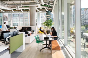 In promotional literature, Miller Thomson’s Vancouver space is described “very much like a town, complete with streets (corridors), neighbourhoods (separate working zones with a handful of enclosed offices), even a town square (a large, landscaped atrium where employees congregate and have spontaneous dialogue).” Perhaps the most striking single element is a full-blown theatre with bleacher seating. The underlying idea is that meeting spaces in big firms now need to be designed less for closings and more for firm-wide events and legal education functions that draw in existing and prospective clients. (The firm goes so far as to refer to its revamped Vancouver office as a “legal knowledge centre,” which may be too buzz-wordy for all but the firm’s most eager boosters.)
Miller Thomson has 12 Canadian offices. And the new Vancouver arrangement has been a subject of curiosity — even controversy — among partners from other cities, especially those middle-aged and up. (One Toronto-based Miller Thomson partner told me that if someone tried to take away her office, “they might get hurt.”) But in Vancouver, Walker says, there is a widespread consensus that the new design has been a success. And at least one smaller Miller Thomson office, in Vaughan, Ont., has followed this example.
“Even the older lawyers, the ones over 50, proved to be way more adaptable than we originally thought,” Walker told me. “These are lawyers who, by their nature, tend to be super-focused on client relationships. They’re driven to find ways to take care of business. So they’re making the situation work.”
I had difficulty finding any Vancouver-based Miller Thomson lawyers who were critical of the new arrangement — though it is possible that some dissenters are keeping mum for reasons of office politics or they simply decided to move on to other firms. But, for what it’s worth, Walker’s assessment is largely consistent with what I heard from foreign lawyers whose firms performed similar architectural transformations before the trend came to Canada.
“I once swore that I would quit law before I went open plan,” says Adam Farlow, a partner at the London, U.K. office of Baker & McKenzie LLP. “But when we tried an open-plan satellite office at Canary Wharf, that was the deal — take it or leave it. And I loved it. I thought it was great to be able to know what the team was doing. And it turned out that having 100 people in a room means that you don’t hear anyone speaking, while having an office shared with one or two other people means you hear every conversation.”
Law firms always are looking for marketing angles that help distinguish them from the competition. And so it shouldn’t come as a surprise that Miller Thomson turned its move to 725 Granville into a publicity opportunity, creating a high-end promotional video celebrating the space (Google: “Great Spaces: Miller Thomson LLP”). And in the months since, Walker says, he has entertained numerous visitors who are interested in creating similar transformations at their own firms.
But not everyone is convinced that open-concept offices are the wave of the future. And some firms that have studied the option closely have chosen to pursue another path.
When Éric Bédard, managing partner for the Quebec region of Fasken Martineau DuMoulin LLP, consulted with designers about the best structure for Fasken’s new Montreal offices in Place Victoria, they came up with a list of priorities very similar to that compiled by Miller Thomson’s Vancouver staff. Everyone wanted to make sure there was plenty of sunlight, opportunities for collaboration and a layout that encouraged esprit de corps. “With young lawyers, you are competing against other spaces, because these people are used to working everywhere,” Bédard told me. “So you need to create an attractive space where they want to work. That’s the goal.”
At Fasken’s new Victoria Square offices, the walls near the building periphery are made of glass to allow an unimpeded flow of sunlight. The firm also organized its physical space vertically in a way that encouraged staff to leave their departmental bubbles, with a central stairway providing access to unique common spaces on each of the firm’s floors: a cafeteria on the 34th, conference rooms on the 35th, a lounge on the 36th and the library on the 37th.
But Bédard and his colleagues made a more traditional choice when it came to lawyers’ actual work spaces. In this regard, he tells me, a big part of his decision came down to personal impressions of professional offices he’d visited where the walls had been taken down.
“I saw a lot of disorder,” he tells me. “In some cases, it was kind of a mess. Also, I noticed that a lot of the people were wearing headsets — including the big ones that block out noise — to help them concentrate. They would be sitting there with two computer screens in front of them, totally isolated. I’m not sure that is really helping collaboration.”
The design that Fasken adopted was a hybrid: physically compartmentalized but visually open plan. Modestly sized 120-square-foot lawyers’ offices encased by glass are situated on both sides of the corridors that form horseshoe patterns along the perimeter of each floor. The assistants are clustered in open areas at the corners of the building. According to Bédard, the layout gives his colleagues plenty of opportunities to collaborate since the transparent walls provide a sense of collegial accessibility. But they also allow them to hunker down on a lengthy conference call or plow through a thorny project that requires intense concentration.
The term “open concept” arouses strong feelings in many of us. To some traditionalists, it connotes a lack of privacy or a faddish nod to the esthetics of Silicon Valley. Drew and Jonathan Scott, the telegenic identical twins who host Property Brothers, report that a fan once chased them down a street in New York yelling “Open concept sucks!”
But, ultimately, a law firm’s most valuable asset is its human capital. And firms that do not adjust their operations to the expectations of young lawyers will have difficulty recruiting the best talent.
Moreover, as clients become increasingly aggressive in negotiating fees downward, law firms are feeling pressure to lower costs. In most cases, real estate is a firm’s second-largest expense category, after labour.
Trish Callon, senior vice president and general counsel for Sun Life Financial Canada, told me that one of the reasons her legal team adopted an open-concept, hot-desk model at its new One York St. offices in Toronto was data showing that workers usually spend only about 70 per cent of an average workday in their offices. The rest of the time, when they are on discoveries, meeting with colleagues, sick, grabbing lunch or coffee or on vacation, Sun Life is paying rent on unused space. A hot-desk model allowed the firm to create desk space for the number of lawyers who actually work in the office at any given moment — not the total number of lawyers who happen to be on the payroll.
As far as recruitment goes, many prospective hires are not only fine with such arrangements, they actually regard it as a plus. “This is how millennials see themselves working in 2017,” Callon tells me, gesturing toward a large communal space segmented into neighbourhoods with (slightly too cute) names such as “Litigation Lane,” “IP/IT Intersection” and “Corporate Secretary Cul-de-sac.”
“A lot of young lawyers are free spirits with a laptop and a cellphone,” Callon adds. “If they were coming through our [old] space on King St., they’d say that’s where their grandmothers worked.”
The trend toward open-concept space in law firms represents a change in the way lawyers relate to their work and to one another. But it is also part of a broader trend in the way the legal community relates to the rest of the business world. The marketing approach favoured by many modern firms tends to stress the lawyer’s role not as a guild specialist but as a collegial consultant who can improve corporate bottom lines by operating collaboratively with entrepreneurs. As such, the conventions of law inevitably will come to resemble those of other fields. In our discussions about architecture, Sixta, Walker, Bédard and Callon all told me that they were mindful of trends taking place in fields well beyond law — such as accountancy, real estate management and information technology.
In late October, I drove due west from Toronto to the Lake Huron port town of Goderich (pop. 7,628). Few Canadians have even heard of the place. But it has a rich history going back centuries, and it remains home to the largest underground salt mine in the world — an underground marvel that occupies seven square kilometres.
Goderich is also a town that situates law at the centre of civic life. Its downtown area is based around an eight-sides road octagon known (somewhat confusingly) as “The Square.” (John Galt, the original Canada Company commissioner who created the plan, reportedly was inspired by the Roman architect Vitruvius.) And in the middle of this stands the art deco-inspired Huron County Courthouse, the historic site where Steven Truscott was falsely convicted of raping and murdering Lynne Harper in 1959.
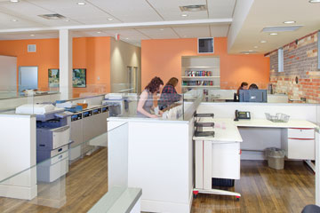 I’d come to Goderich to interview Heather Joy Ross, the founding partner and general counsel of The Ross Firm Professional Corp., whose second-floor offices span two of the Square’s legacy buildings, once occupied by a (now-defunct) department store and an apartment block. Six years ago, the Ross firm renovated this 6,000-square-foot space not once, but twice. The first iteration was completed in the summer of 2011, just in time to be wrecked by a freakish tornado that ripped through Goderich in late August. A few weeks later, the very same build-design team, Hugh Burgsma Complete Construction, came back to do the whole thing over again. In Toronto, this sort of high-end office construction would easily cost seven figures. But in Goderich, where skilled trades can be hired at far more reasonable rates, the whole thing cost $300,000.
The Ross Firm is not a full open-concept build: The northern two-thirds of the office, which once served as a store, have been transformed into a single modern, sunlight-drenched space. But the southern portion, carved out of former residential units with lower ceilings, is a traditionally segmented office space for the firm’s lawyers — including Ross’ son Quinn, and her husband Paul, the firm’s founder.
When you climb the stairs to The Ross Firm, the very first thing you see is a large plate-glass window that looks directly on to the courthouse in the middle of The Square and the businesses that ring it. As an architectural signifier, it serves to emphasize the firm’s connection to Goderich, the town’s civic life and its legal community.
On the other side of the reception desk is a large glass-walled conference room, which shares the same view. “If we had done a traditional law firm layout, that’s where the partners’ offices would be,” Ross tells me. But she made the intentional choice to keep the choicest office real estate within the firm’s shared sphere.
“I grew up with a mother who created in me a sense of social justice and egalitarianism,” she says. “And in the course of practising law and being a [law society] bencher, I have had a chance to meet lots of lawyers on the golden mile [large Bay Street law firms]. On one occasion, I had a chance to use one of those firms as a client. The experience felt cold. I had a chance to place myself in some very expensive chairs and some very expensive boardrooms. But it was intimidating. So, when I had my own law firm space, I knew I wanted the clients who honour us with their business to have a very different experience from that. Their first view when they come up those stairs — of the court and the whole town — they catch their first glimpse of that, and I can see them just visibly relax.”
When I made my own living as a lawyer in the 1990s, each of the three firms where I worked presented clients with the same architectural experience that Ross described with distaste: They would step off an elevator to arrive at an austere reception area, then, once admitted, proceed past the assistants, then the associates, then finally on to the offices of the partners, which had the largest footprint and the grandest views — enclosed behind wood and drywall. The opaqueness of it all was intentional: Visitors felt like they were progressing into the inner chambers of a temple.
Most lawyers don’t wear robes or wigs these days. But some still use architecture to achieve that same status-signalling effect.
This model has gradually been changing over the last few decades. Opaque walls turned translucent, then transparent. Designers started looking more closely at air quality and lighting, and they stopped treating assistants and clerks as office-plan afterthoughts. Offices shrank and became more uniform. When Osler Hoskin & Harcourt LLP in Toronto recently renovated its offices at First Canadian Place, for instance, it instructed lawyers to get rid of all their personal furniture and replaced it with generic Osler chairs and desks. There simply wasn’t room for all the old overstuffed chairs and couches, Osler COO Ruth Woods says. And the new policy means offices can be moved in a matter of hours, since it is only contents, not furnishings, that now require relocation.
The idea of an office as a sprawling expression of one’s personality and professional style — crammed with mementoes from old closings, signed photos, kids’ artwork and expensive sports memorabilia — is fading away. More and more, it is just another flat surface where you stick your laptop and access the internet. To the extent that it has any useful moral signalling effect, that effect is more and more being created for the sake of clients, not lawyers. And why not? That’s the way things work in every other industry.
If the old architectural model drew inspiration from a temple, the new model more closely resembles a café or white-collar workshop, welcoming clients and recruits into a culture of common purpose, instead of awing them with guild atmospherics. Open concept isn’t just an architectural fad: It’s an expression of the profession’s changing identity.