Last week, Adobe Systems released the latest version of its popular and standard-setting document software, Adobe Acrobat. The latest version is called Adobe Acrobat DC.
The DC stands for document cloud. It represents the program’s new powerful cloud-based features that allow users to work with the software across all platforms, whether desktop, mobile devices, or the web.
The previous version, Acrobat XI, was released in the fall of 2012, and the one before that, Acrobat X, in the fall of 2010. Each version represented various new features. The DC version is an overhaul of the software; a very positive one.
While the mobility and cloud-based features are a big part of the overhauled application, the issue of cloud security for the legal profession is a topic best left for another day, given the many complexities and issues associated with security and client confidentiality. However, there are many and significant new elements to the new version, both in substance and style.
Since many in the legal profession work with documents in one way or another on a regular basis, it is worthwhile looking into these new features.
Interface and menus
The first thing that strikes me about the new software is the interface. It is modern, dynamic, and intuitive. From a look and feel perspective, the new menu buttons have some colour symbols. The colour of the text of the menus is in a light shade of grey, with a bolder shade appearing over menu items that are selected or where the mouse curser hovers.
These stylistic new elements help place the focus of attention on the document, rather than the top or right menus, and that is good. They are also designed to look and feel similarly on mobile applications. The application has a smooth and welcoming feel to it.
More importantly is how the new version groups together and presents the many options for viewing, editing, commenting, or performing the many other available tasks to your document. I must confess even as a frequent user of Acrobat, I discovered new features to the program shortly after opening a document in the new version. I think this was in large part because of how the new version presents the menu options, which is more accessible and intuitive.
Essentially, each main feature, when selected, presents options spread across the top and right of your screen in easy-to-understand and large text. Aside from the tremendous eas of use this gives desktop users, it also lets users work seamlessly with these options on tablets and mobile devices. In other words, the menu layouts and features have largely moved away from the traditional dropdown style, to large icons and large layouts, so they can work on mobile devices.
In addition, you can easily add custom tools to your top menu, without having to go through several customizing steps. Simply right-click your mouse anywhere on the top menu, and a dropdown menu appears that allows you to choose from a multitude of custom tools you can add to the top menu.
 The tools menus
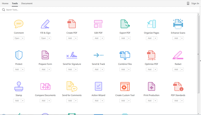
Clicking on “tools” from the top menu no longer brings up a dropdown list of options. Instead, a full screen suddenly appears, replacing your document, in which many options appear as large icons.
Each icon is unique. Choosing “open” changes the screen entirely — now this feature takes over the screen with the various sub-options appearing in large spaced-out font, together with their settings and functions.
For instance, choosing “organize pages” brings up large thumbnails of every page of your document spread out over your entire screen, with a new submenu that appears on the top of the screen, giving you an option to manipulate the pages as you need. Everything you need to have is now made available to you on the screen in big and easy-to-find font and icons. Looking for options is no longer a search mission.
As another example, choosing “comment” from the main tools menu (incidentally, the main tools options are also available on the right-side of your document right from the start), brings up a multitude of commenting options on the top screen, while a listing of your comments and other highlighting, which remains conveniently on the right side of the screen, now has many search, sort, and view options listed in the same area.
You can easily return to your document or the main options menu by choosing so from the top left corner options.
In addition, the top of the main tools screen allows you to search your tools menu. For instance, if I type “annotate” in the search field, the program instantly takes me to the comment feature. My page now displays the comment feature prominently on the centre of my screen, with a sea of white space around it, and beside the main feature a listing of three options: “sticky note,” “insert text,” and “replace text.”
I no longer have to read the manual or go through an extensive analysis to figure out what option relates to what feature — the search capability does this work and instantly displays the options you are searching.
Editing documents
The expanded editing capabilities are particularly interesting to the legal profession, where we regularly have to process documents among various applications (for example, Word, Excel, pdf) and make revisions.
The revisions capabilities in Acrobat have increased in their range with its versions. The latest version has many more intelligent and powerful capabilities to revise text in the body of the pdf document, without having to go back to the original application, whether in Word or otherwise. One of these powerful features when you choose the “edit pdf” option is a smart text boxing that appears around different parts of your text.
This boxing allows you the ability to add text directly to the pdf document without creating awkward blank spaces or changing the layout of the lines or paragraphs. The application achieves that by assigning different parts of your document to different boxes, thereby giving you a safe area (the box) to add or remove text without affecting surrounding parts of your document.
You can even change the shape of the frame of the box where you are trying to make changes in order to increase the margin or space of that particular area, so that your additions or removals do not affect the rest of the document.
In addition, the application has better font recognition capabilities to match the font of your document.
Many other features
There are literally countless more new interesting and powerful features that Adobe has added to its latest version of Acrobat. Depending on the type of feedback and response I receive to this article, I will be happy to write a follow up about additional, more advanced, features.
Adobe provides a free 30-day trial period, so go ahead, register, download the software and enjoy the free trial period. Once you do it, you will likely not want to go back to any older version, whether because of the stylistic or substantive changes, or both.
Adobe is trying to move purchases to a monthly subscription price, which also includes access to documents through its own cloud service, enabling mobility and access through various devices. The monthly cost is US$12.99 per month for the standard version, or US$14.99 for the pro version. This includes access to mobility applications.
As an alternative, desktop stand-alone versions are still available for purchase. The cost is US$299.00 for the standard version (or US$139.00 for those upgrading from an earlier version), and US$499.00 for the pro version (or US$199 for an upgrade).

 The tools menus